FOX Sports App
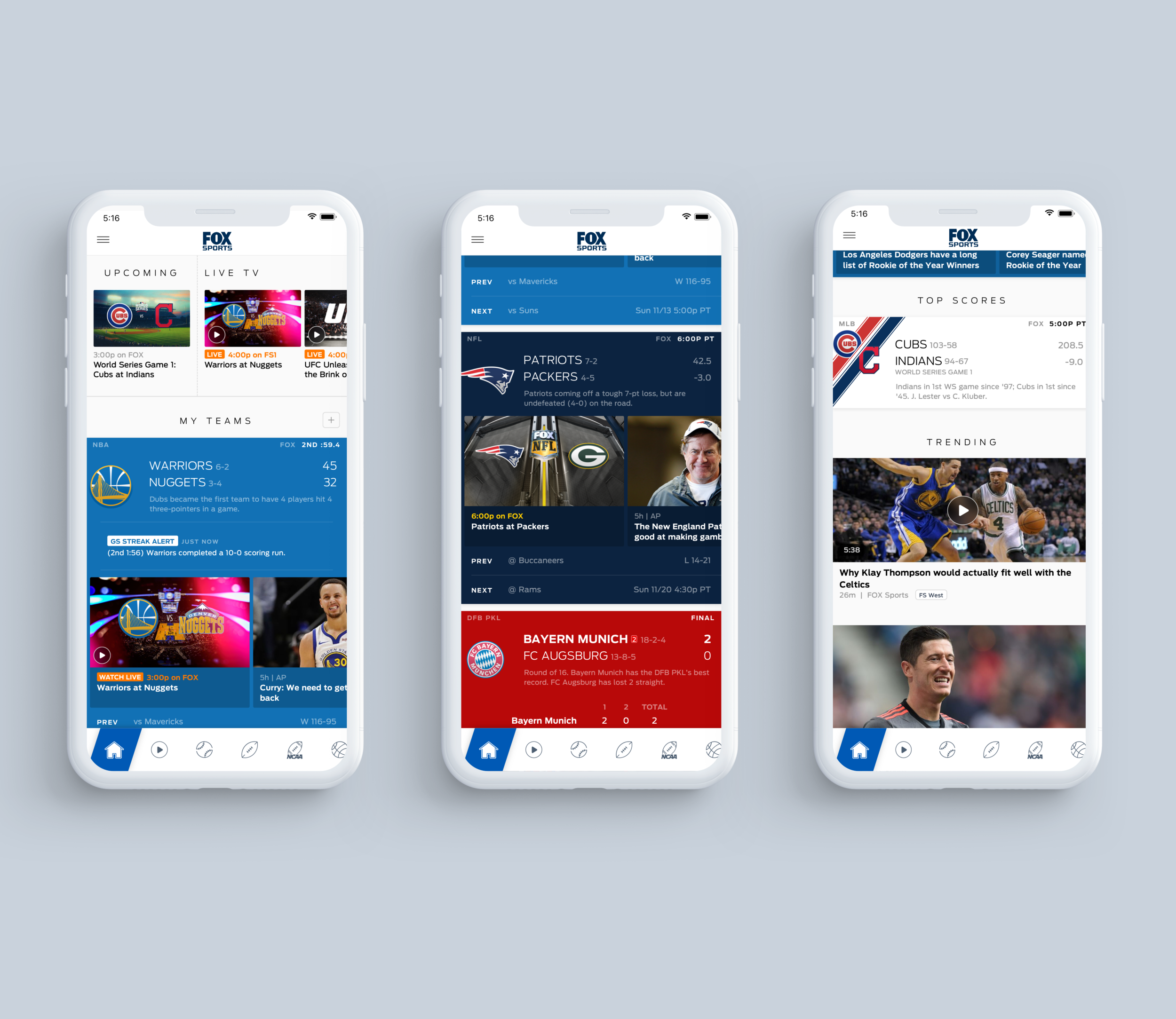
In a commodified market, FOX Sports had to provide distinction that resonated with the brand and added value to end users while still delivering on expectations. The team flattened the UX by bringing relevant info directly onto the scoreboard--live game headlines, key plays and stats, and the latest news. It simplified navigation relative to other apps, making it easier to get where you were going. And it developed best-in-class notifications to provide utility beyond app browsing.
Personalization
CHALLENGE: Offer user customizations that optimize the UX according to user interests.
SOLUTION: Use a ‘hero’ design treatment for favorites to deepen emotional engagement. Deliver more info on the scoreboard for games involving favorites. Provide attractive and effective personalization prompts. Prioritize a user’s favorites on all screens. Encourage selection and reordering of main navigation items.
Live Streaming
CHALLENGE: Integrate live streaming functionality into the core UX of a sports app, rather than forcing users to select between distinct modes.
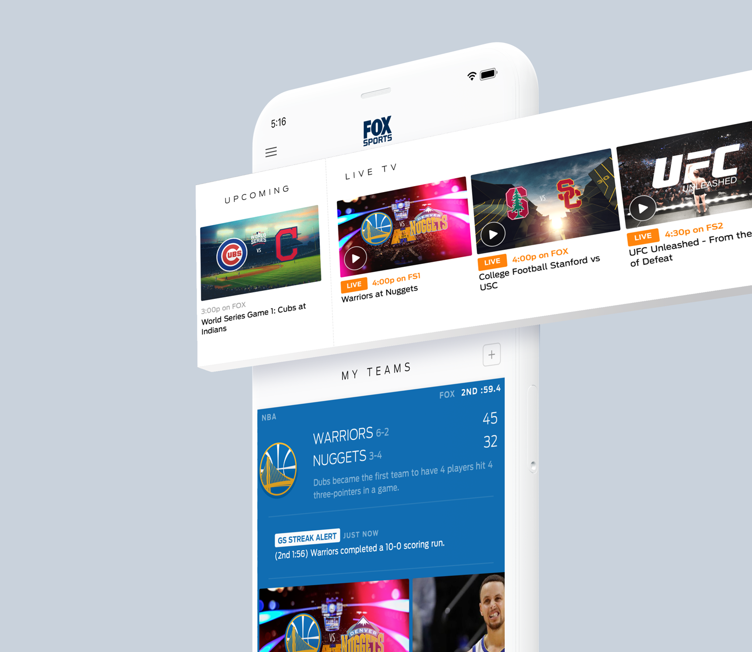
SOLUTION: Add a streaming carousel at the top of the Home screen for fast access to live programs and promotion to all users without interfering with other user journeys. Incorporate the top upcoming event to drive awareness there. Integrate visually-rich calls to action on scoreboards for events that are available to stream, including related shoulder programming.
Player Functionality
CHALLENGE: To extend engagement with video, allow concurrent access to other salient features in application and on device.
SOLUTION: Integrate auto-play portrait video into all event screens—Summary, Box Score, Videos—to expose related event content. Incorporate Player in Shows and Highlights screens to facilitate playlisting. Provide PiP bar to enable browsing entirety of app while watching. Leverage OS-level PiP functionality to allow user to multitasking while continuing to stream.
Watch & Listen
CHALLENGE: For users exclusively looking for video/audio, offer a portal that cogently organizes the depth of breadth of content offered while encouraging discovery.
SOLUTION: Orient the user with a Watch & Listen screen providing guided access to main areas—Live, Highlights, Shows, Podcasts. Build optimized interfaces for each of these main areas. Add a shortcut to primary navigation. Create new notification options for heavy media consumers.
Team Pages
CHALLENGE: Deliver an improved and differentiated experience around teams.
SOLUTION: Offer a Team Home experience that acts as a “dashboard”—adding unique insight into the team’s season narrative, beyond the conventional “snapshot” perspective. Create unique interactive ‘widgets’ that encourage further exploration of key dimensions of the team’s season narrative. Provide multiple means of entry—from Home screen, scoreboards, standings.


